I never thought I would create my own blog but during a small discussion I had at home with a friend this evening, I decided to give it a try... This friend is Martin Melchior and, if you are in love with electronics or photography, you should visit his blog: http://www.martinmelchior.be/.
While we were discussing, I realized that I already met a lot of situations where I had to look after a tutorial, where I did something that other people could find interesting too, or just where I might want to share something... This is why I'm posting this first article.
So, I decided to create this blog on Blogger because as Martin said, Google tends to promote its own products and it my help for a better ranking in Google Search.
As I wanted to create a blog, a began checking Blogger's suggested themes... but then I remembered a sentence that you might have already heard:
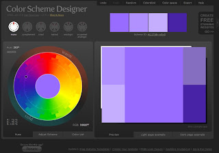
Less is more!In this case I tried to apply it to this blog's design as I didn't want to include a lot of background effects, animated pictures, complicated fonts... I just decided to have a dark background because I find it easier to read and I used an online tool to select my fonts colors: http://colorschemedesigner.com/
It is easy to use: you simply type one hexadecimal color code and it will give you other color codes that are compatible with the one you selected. It is really useful when you're designing a website template or a web application theme.
In this blog I decided to use a dark background, a white standard font (Courier) that is compatible with just any device and light blue links.
I hope you will find this blog comfortable to read like this.


No comments:
Post a Comment